Now that I've showed you how neutral walls can work in your home, it's time to talk about how you can go BOLD with your fabrics, furniture and accessories!
Unsure how you can mix things up by using color in your home without going overboard? Let's take a look at the color wheel to get a better understanding!
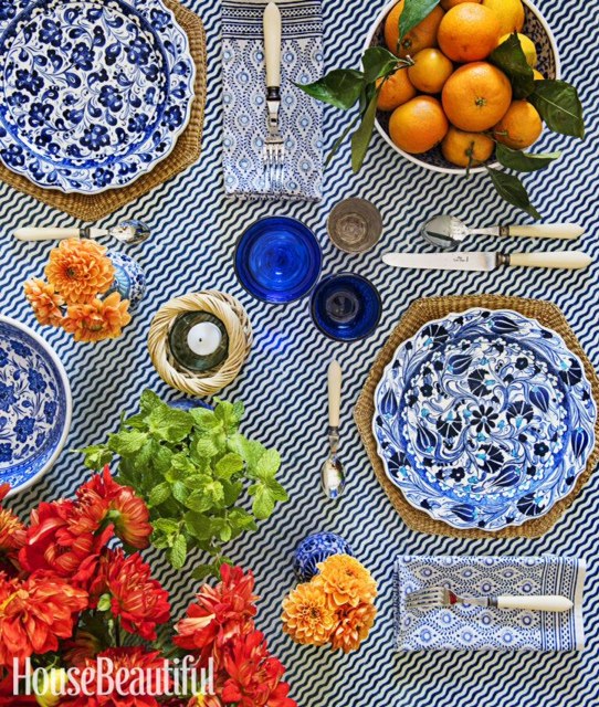
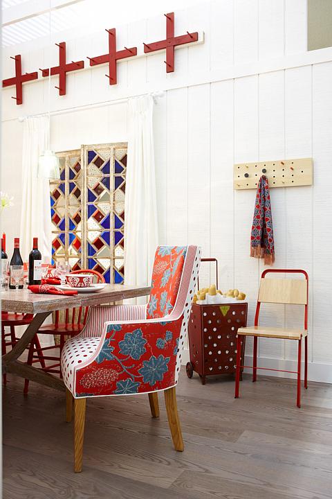
If you're new to mixing prints and patterns I suggest sticking to one color family. It's an easy way to ensure your decor is cohesive and bold without going overboard. Red is a bold color and many people find it hard to commit to such a strong color, but this red and neutral kitchen shows you how great it can look if you take a chance! I just love how Sarah Richards mixed polka dots and floral fabrics along with many other shades of red.
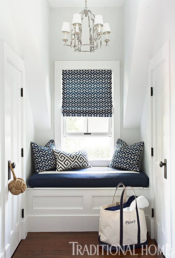
If it's a small area in your home that you're looking to redecorate I suggest sticking to one pattern and one color to make the most impact without looking cluttered. The use of a bold geometric pattern in a rich navy color makes the small cozy hallway nook have a big impact!
This room has just a hint of color! If you're looking to step outside your comfort zone when it comes to adding color to your home decor and want to add more than one hue I suggest going with complementary colors (colors that are opposite each other the color wheel!) It is a great way to add a subtle hint of color into an otherwise neutral room, especially when it's added in small doses like this. Get more tips on adding complementary colors to your home here.
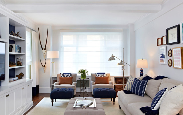 photo via
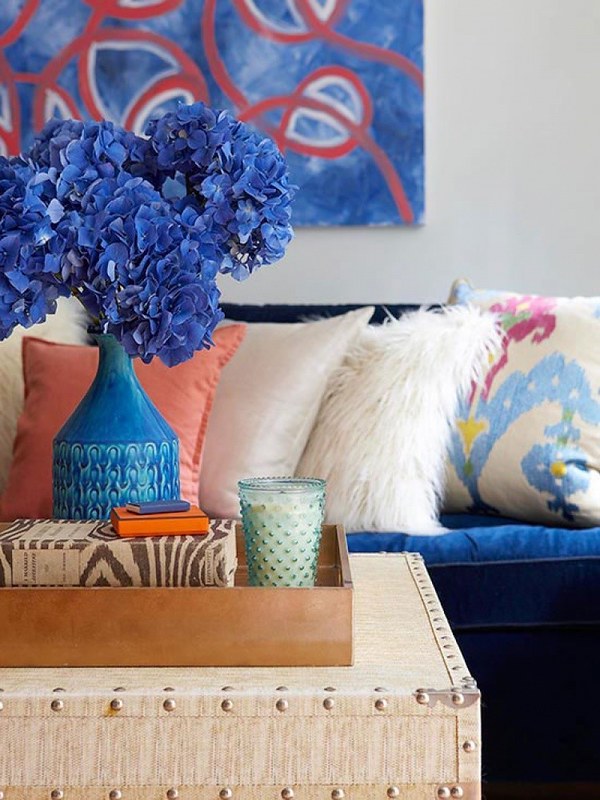
Still interested in mixing two colors, but looking for more of a impact than the above? This living room shows you how you can take the same two complementary colors and go even bolder! Little things like a piece of colorful artwork, couch pillows and fresh blooms really make a difference when changing up your decor.
There's nothing more bold than to paint your ceiling a color. It's extremely untraditional, but it's so visually appealing you'll wonder why more people aren't doing it. The bold blue ceiling and rich wood stairs in the photo perfectly compliment the photos of the gallery wall.
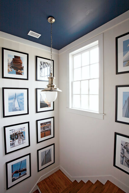 photo via
(Ceiling is Benjamin Moore "Van Beusen Blue")
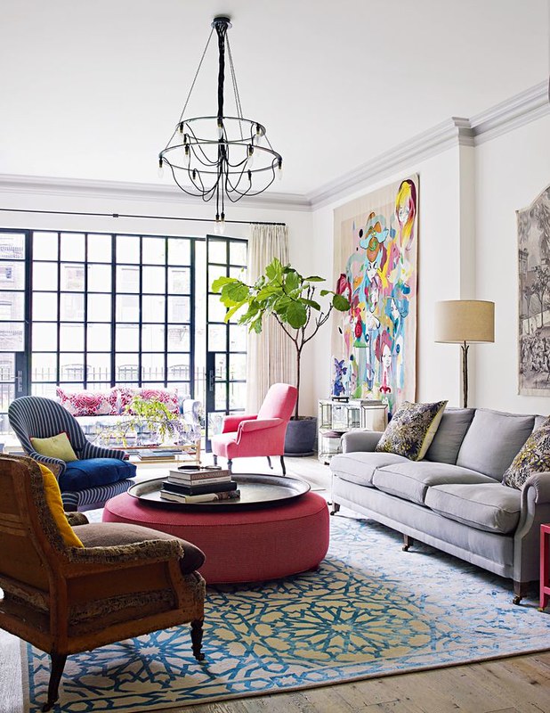
And then you can just take a leap of faith and opt to add multiple colors and patterns to your room instead! Somehow the neutral walls, gray couch and amazing natural lighting in this living room provide the perfect canvas for a healthy dose of color and pattern and artwork that make me rethink my more neutral decor taste.
So are you brave enough to go BOLD? I hope I've shown you that it's easier than it seems! Whether it's one item or a whole room it's time to hold your breathe and take the plunge into the world of bold decor!
Check out these past Bold Decor posts for more inspiration!
Shop a few of my favorite bold home accessories:
Labels: interior decorating, mother daughter, room for style